2019-11-29 17:20:46
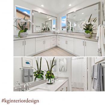
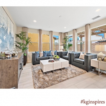
These walls are very plain, but by adding green from the plants, it adds a pop of color to the space.
2019-11-27 18:58:26
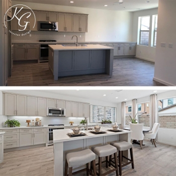
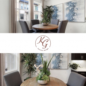
In order to keep the kitchen balanced because of the odd placement of the cabinets, I added the two art pieces to balance the space. Also, the dining room area was so small that we had to ensure we had a dining table with the proper scale so it wouldn’t be too crowded.
2019-11-25 17:32:11
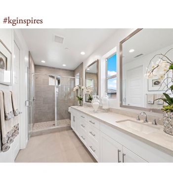
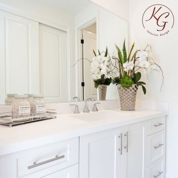
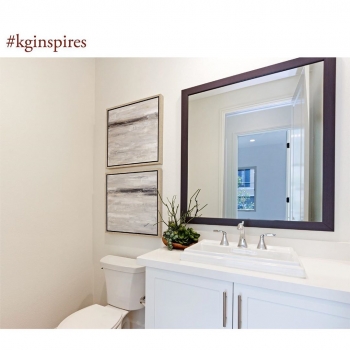
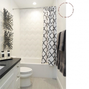
By pulling some of the colors of the floors into the towels, it brings this palette to life, as well as the plants help to make this space stand out.
2019-11-20 19:44:42
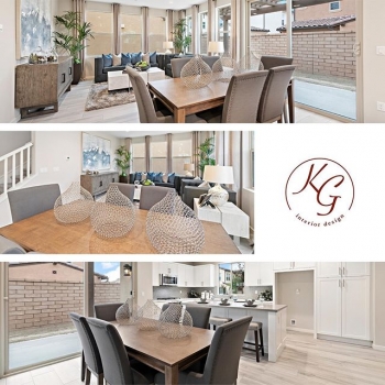
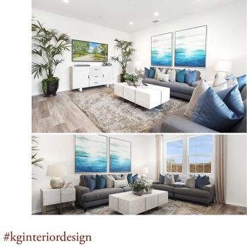
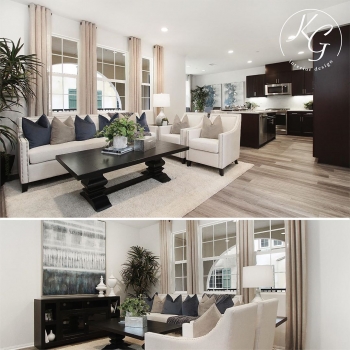
It is very important to have furniture to the proper scale in this home with an open floor plan, while also maintaining a lot of seating space.
2019-11-18 17:51:48
This small living space had no emotional connection. We warmed it up with using light and dark tones, added drapes to distract the eye from seeing neighbors, and decorated with beautiful accessories to make the home feel warm and inviting.
2019-11-08 15:17:02
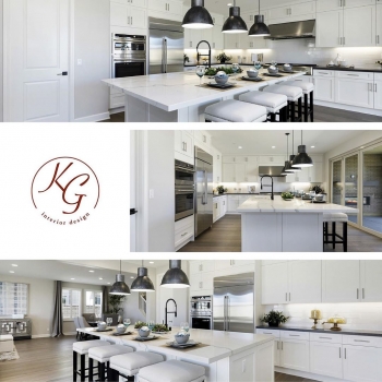
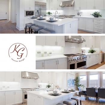
This kitchen was highly upgraded, so as a staging designer, I ensured that we used minimal decor to decorate this space.
If a space like this has too many accessories, buyers would not be able to see past the stuff and may miss the beautiful upgrades.
2019-11-06 21:05:16
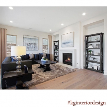
This home included cut outs that buyers did not know what to do with because of their awkward depth. In order to fix this and to help buyers visualize the possibility of this space, we added a bookcase that was to the right scale of the cut outs.
2019-11-04 18:42:25
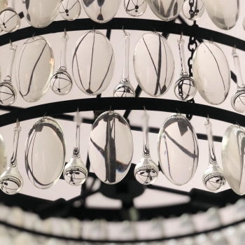
This beautiful chandelier adds just the right amount of bling to this master bedroom.
2019-11-01 19:04:37
Stacking the same pieces of art over each other in the reverse looks really good in this space. It makes them appear as if they are similar but not exactly the same.
2019-10-30 19:28:56
The art here is our inspiration. We accented our space with the beautiful vibrant colors from the art on the white walls which warms the space.
2019-10-23 13:05:00
I love the open concept of this kitchen. When staging a home, it is crucial that the countertops are not cluttered. This kitchen has a warm feel because of the minimal decor that doesn’t detract from the counter top and appliances.
2019-10-22 18:20:15
In this extremely small space, we needed to ensure that we used the proper scaled furniture in order to make the space feel larger. It is so important when selling a home with small spaces, to have furniture with the correct scale and reflects the style of the home.
2019-10-18 12:13:10
I love the branches that we used as art on the walls, they are a great way to add texture to the room. The bathroom was painted white and I spray painted these branches gray to go with the decor as well.
2019-10-16 12:30:30
By adding a round wooden table instead of a rectangular one, it allowed us to open up this small dining room. The Swiss Coffee walls, big pieces of art, and drapery panels really helps to warm up the rooms to perspective buyers.

