2020-02-14 15:15:42
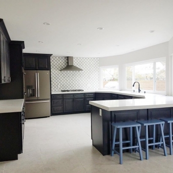
This client needed a kitchen that functions with a lot of counter space for cooking and storage. I recommend an Island for additional counter space and storage, but they wanted to keep more of an open concept. By using darker cabinets, I really like the contrast of the flooring, backsplash and countertops
2020-02-12 17:11:11
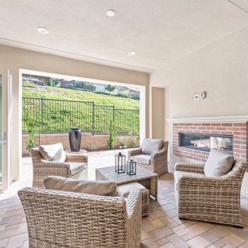
This yard was small and the biggest complaint buyers had. It was sitting on the market for months. Once we staged the outdoor living space and made it a part of the interior, we had multiple buyers in less than 24 hours. Our clients were extremely happy
2020-02-10 19:48:53
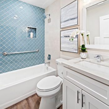
This bathroom is very dated. By adding new flooring, cabinets, and fixtures modernizes this space. I also wanted to Create drama by using this beautiful accent tile
2020-02-07 18:10:41
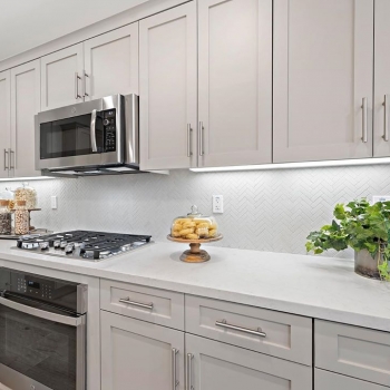
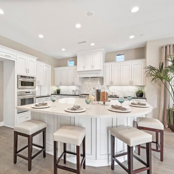
This is a beautiful upgraded kitchen. When staging a kitchen like this we do minimal accessories so that the buyers can see every upgrade
2020-02-05 19:29:11
Hire KG for staging! We offer design services to insure your clients make the right choices with paint, carpet and any other upgrades your clients want in order to maximize their price on the sale of their home
2020-02-03 18:59:38
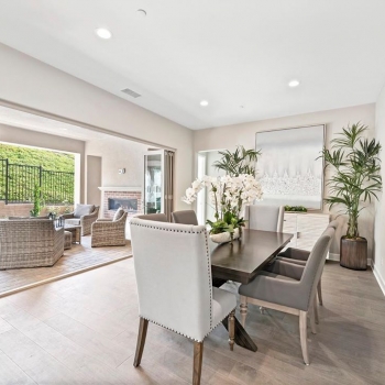
This was a very narrow dining room. I needed to make sure I had furniture to scale so the room felt spacious. Having a cohesive feel throughout is extremely important. Which is why I tied the dining room, living room, and outdoor living space with the same color palette so it felt like one large space
2020-01-31 18:35:10
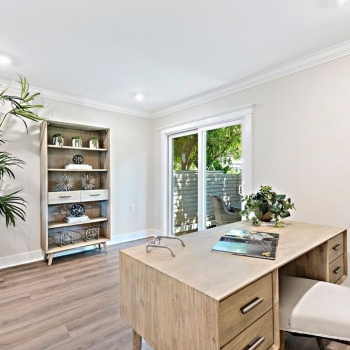
I love adding accessories in repetition on bookcases. It gives balance and symmetry
2020-01-29 20:16:32
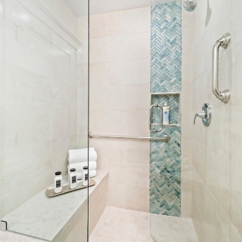
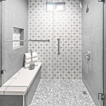
When we reconfigured the space, we were able to make a larger shower and expand the bench. We also used a very neutral tile and the glass tile as an accent
2020-01-27 20:33:36
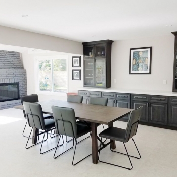
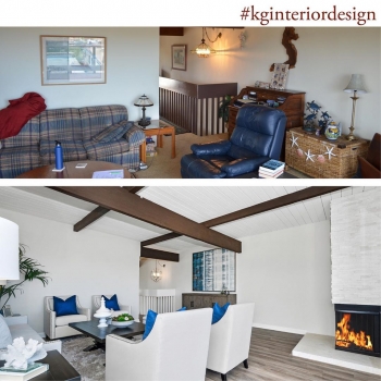
Sometimes we don’t know what to do with the original brick, so by painting it grey, it pops and modernizes the space
2020-01-24 18:03:56
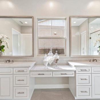
I love how light and bright the bathroom is. The white cabinets with the white quartz countertops really modernizes the space
2020-01-22 20:11:16
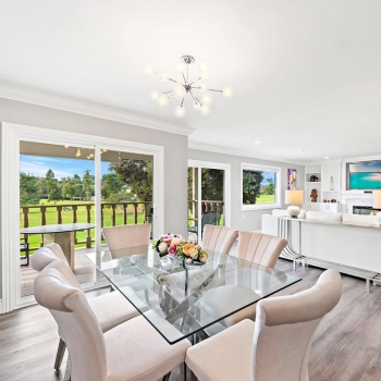
The focal point of this dining room is the chandelier, it has a retro vibe to it. Also, in order to give this space a cohesive look, we used splashes of fuchsia throughout the dining room
2020-01-20 17:47:11
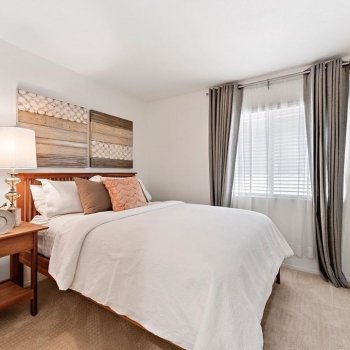
This owner occupied bedroom felt very small with all of the furniture in the small bedroom. By removing the larger pieces of furniture and moving the bed closer to the wall, the bedroom feels much larger. Also by adding accessories to the space, it makes this room feel larger and warmer
2020-01-17 19:18:01
This kitchen is highly upgraded so by adding muted colors within our accessories and tying in blue glasses helps to keep the color of the home cohesive
2020-01-15 19:07:38
My inspiration was the back wall of the master shower. I loved the blue linen tile on each side wall which really makes the inspirations pop. When I selected the penny rounds on the shower pan they pulled the entire pallet together
2020-01-13 20:47:49
To efficiently sell a home, it needs to look clean and inviting. Buyers need to see a product that makes them feel warm and inviting

